Posts
Journal: 26 Jan 2019
A usual Saturday with my girlfriend.
We went to the cafe for breakfast, and I had the usual. Which for a while they didn’t remember, and I had to say my order. First world problems definitely.
We then spent a few hours shopping for our new house (not moved in yet, but it’s ours!). We have things like saucepans, a kettle, cleaning supplies, etc.
I then watched some more football, as there’s a bunch more FA Cup games going on this weekend. A lot of small teams beat major teams, and while that process the magic of the cup, they hardly ever win by playing good football.
Journal: 25 Jan 2019
Friday!
A mixed day, that started reasonably well. Work was good, I got a few things done, and the engineering department took part in a code kata session, which was pretty fun.
I then had a nightmare getting home, as the underground train I was on suddenly stopped, waited for 10 minutes, and someone then pulled the passenger alarm. Which meant that had to be investigated, and as usual it was a good false alarm. But following procedure, it had to be investigated, and then it can be reset. However, there was some kind of fault with this, and it was unable to be reset. So everyone on a busy train at peak time had to exit the train, onto a packed platform. Because the train had to be moved out of service. I decided to stop waiting and walk the rest of the journey instead. It was a 45-minute journey, instead of the 5 minutes, it would have taken on the tube. Luckily I walk fast and did it in 30 minutes, but I would rather have not walked it.
It then got worse with the football, as Arsenal lost their FA Cup match against Manchester United 1-3. Arsenal seemed to dominate the game, but two major injuries and defensive mistakes cost us again.
There was still some good points throughout the day though, as I listened to two podcasts today! The first one being episode 227 of Connected, and the other being a very old episode of Mac Power Users from 2015 with John Gruber.
Journal: 24 Jan 2019
It wasn’t work as usual today, I worked from home! So meant I was pretty productive and managed to focus on a few things.
It’s always weird when I work from home because I seem to forget about a lunch break. I usually go between 12:30 and 1 pm, but if I’m at home I forget about it until about 2/3pm. That’s a pretty weird metric, but it somehow proves my productivity levels. At least to myself.
I listened to the rest of the Talk Show from yesterday, with Joanna Stern. It wasn’t as long as they usually are either, with this one only amounting to 107 minutes.
Over on the blog I wrote about a Quick Look plugin for viewing JSON files, it’s going to be pretty useful for me. There’s a bunch of other plugins I’m going to look into as well.
Also, I managed to watch the remaining episodes of The Punisher. Which means I’ve finished the entire series of 13 episodes in just 5 days. I’m not sure if that’s a good thing or not. But this series was incredible, and I hope they extend it for another!
Previewing JSON Files with Quick Look
Quick Look, the infinitely valuable tool on the Mac that lets you near-enough instantly preview a file. It’s really impressive the number of file formats it supports, but there are always going to be a few things it doesn’t. And that’s where plugins come into it.
One great one that I discovered via twitter today is QuickLookJSON. I’m sure you’ve already guessed what it does. But anyway, I may as well show you as well.
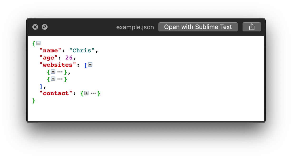
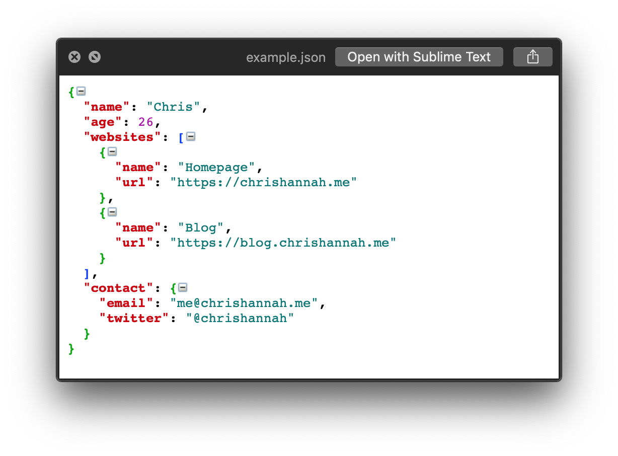
It not only displays JSON files though, it indents them properly, applies a colour scheme, and also lets you expand and collapse any of the data. That last one alone makes it super easy to navigate through a big JSON file.
To install QuickLookJSON, you can either install it manually or do it via Homebrew. The only command you’ll need to run is:
brew cask install quicklook-json
There’s a bunch of other plugins that add further support to Quick Look, like adding syntax highlighting to code, rendering Markdown, and even allowing navigation through a .zip archive in the preview. You can find all of these on one page on GitHub, thanks to Sindre Sorhus.
Journal: 23 Jan 2019
Today started with a quite varied day at work. I was making use of our “whiteboard” walls, trying to map out some potential new features. I did a small number of bug fixes ready for a release we’re planning soon and also helping to get the testing finished.
I managed to listen to one podcast today. It’s mainly been limited to my commute to and from work, as I’ve been watching Netflix at lunch, and usually, relax after work. This time it was an episode of The Infinite Monkey Cage, which is a podcast by comedian Robin Ince, and physicist Brian Cox, and it was about the origin of numbers.
I just saw a new episode of The Talk Show arrive in Overcast, so no doubt I’ll listen to a bit of that tonight. However, they’re always super long, so it will most likely take me until the end of tomorrow to finish it.
As I mentioned on Monday, I’ve been watching the latest series of The Punisher, and as usual getting my way through quite quickly. I’ve since watched another 6 episodes, and I’m actually watching the 11th episode right now as I’m writing this. There’s only two left after this, so my estimate of not lasting more than a week was actually generous.
Journal: 22 Jan 2019
Another day at work! Nothing amazing to really shout about, but nothing to moan about either.
I listened to only one podcast today, Core Intuition episode 357. It’s slowly starting to become one of my must-listens, as Manton and Daniel always seem to have an interesting take on things. And it’s also good to hear developers talk about things that aren’t directly to do with programming.
Following on from yesterday, me and my girlfriend also made another step forward in our house purchase. I had to print out 39 pages in total, with various forms and acknowledgements to sign. Tomorrow I’ll scan them in, and we can start the final proceedings. I would do this on my iPad like most of the document signing I’ve done in the entire process. But the solicitors seem to have an issue with this, and don’t class it as being suitable. I don’t see the difference between annotating directly on an iPad, compared to printing, signing in pen, and scanning it back to PDF. But I’m not in a place where I can change anything!
Journal: 21 Jan 2019
So apparently it’s “Blue Monday” today.
Blue Monday is a name given to a day in January (typically the third Monday of the month) claimed to be the most depressing day of the year. – Wikipedia
The reasoning behind it is that by this time of year, most people’s New Years resolutions are starting to fail, the weather is cold, and everyone has no money because of Christmas.
I wasn’t hit by this strange condition, as my day went pretty well!
I went to work, as usual, got some Swift development done, worked on some more customisation with the Charts framework I’ve been using, had some discussions about the cool things were about to start at work, and just generally had a productive day!
I also listened to the latest episode of Mac Power Users (#466: John Gruber Returns), and it was a really great episode. Three of my favourite bloggers/podcasters all talking about how they perform live shows, the background of Markdown, the Mac, and also the iPad. I always like it when there’s a podcast about blogging, by such long-lasting bloggers.
After work, I discovered something that I’m supposed I didn’t notice the other day. On Saturday I watched the first episode of the second series of The Punisher. I thought that was all that was released. But I forgot that it was on Netflix, and that they just give you everything in one go. So I’ve managed to watch another three episodes already. I don’t expect this series to last more than another week.
There’s also a tiny bit of progress about the house me and my girlfriend are buying. Nothing to write about exactly, as I want to save most of the discussion about it until it’s actually completed. That’s going to take a while longer, but it’s nearly there, and I’m going to be looking through Ikea catalogues a lot more now.
Journal: 20 Jan 2019
Today was a day for a trip to Reading for a party for someone in my girlfriends family. I was reminded how bad I was at bowling, and that I seem to be the only person that has a beer at 12 pm in the afternoon.
It was a bit of a long day, because of the added travelling. But since we’ve been back, I’ve mainly been doing more research into the things we will need when we move our, and also some inspiration for the garden, and my future office.
I’m a big fan of Japanese gardens, but it’s nowhere near the size needed for that, so it’s going to be interesting seeing how I can develop that.
And regarding the office, I’ve got a bunch of ideas on how it could be laid out, and also what types of storage I’ll need. However, I’ve basically come to the realisation that it’s probably best to postpone any purchasing until we actually move in. Because I’ll most likely want to at least paint the walls a darker colour, then I can focus on adding furniture.
The Questionable Fate of the AirPower
David Sparks had an interesting take on AirPower, that maybe not many people actually care about it. But also that it would be good to end all the rumours:
I hope Apple does perfect and ship the AirPower, if for no other reason, so we can start talking about it. Regardless, I can’t help but think in the overall scheme of things, AirPower is small potatoes.
Maybe this is why Apple haven’t came out at any point with updates to the availability of it. They have had real issues with AirPower, like the heat caused by placing so many charging coils together. But there’s been zero news about it since the announcement, at least officially. Maybe because it’s just an accessory that only a tiny fraction of people will get, so it’s not actually a big deal.
Journal: 19 Jan 2019
Today started with me playing quite a few hours of World of Warcraft! At the same time, I was listening to some podcasts, and music from a German artist called Azet. He has an album coming out soon, Apple Music has a couple of them available now.
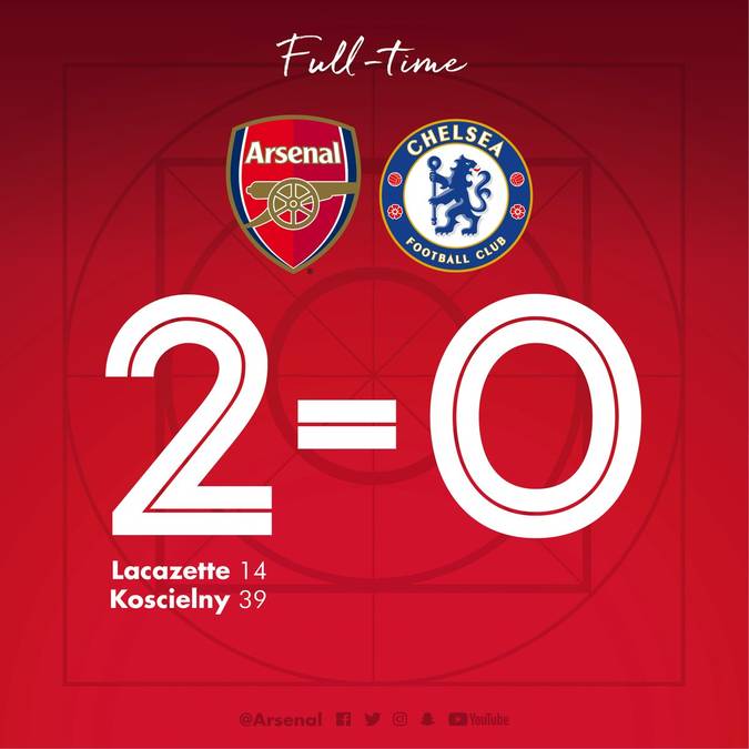
Football was on for most of the day, and Arsenal played the late night kick-off (17:30). We beat Chelsea 2-0 at The Emirates, and it was a really good game. The entire team played well, and with a high-intensity throughout. There was a down-side to it though as one of our players, Hector Bellerin came off the pitch with a knee injury.

Between lunch and dinner time I tried out some cooking. I made a spaghetti carbonara, and I made it as authentic to the traditional Italian recipe as I could (I was watching actual Italian chefs make it on YouTube). It only needed four ingredients: pasta, egg, pancetta, and parmesan cheese. No cream.
One of my favourite television shows is also back for a second series, The Punisher. The first episode is now available on Netflix, and it’s looking just as good, maybe even better, than the first series.