Some Recent Bash Scripting Fun
I've been writing more and more bash scripts recently (GitHub repo). It started when I was playing around with a script called tmux-sessionizer from The Primeagen, that uses fzf to search for directories in a preset location, and then open the selected directory in a tmux session.
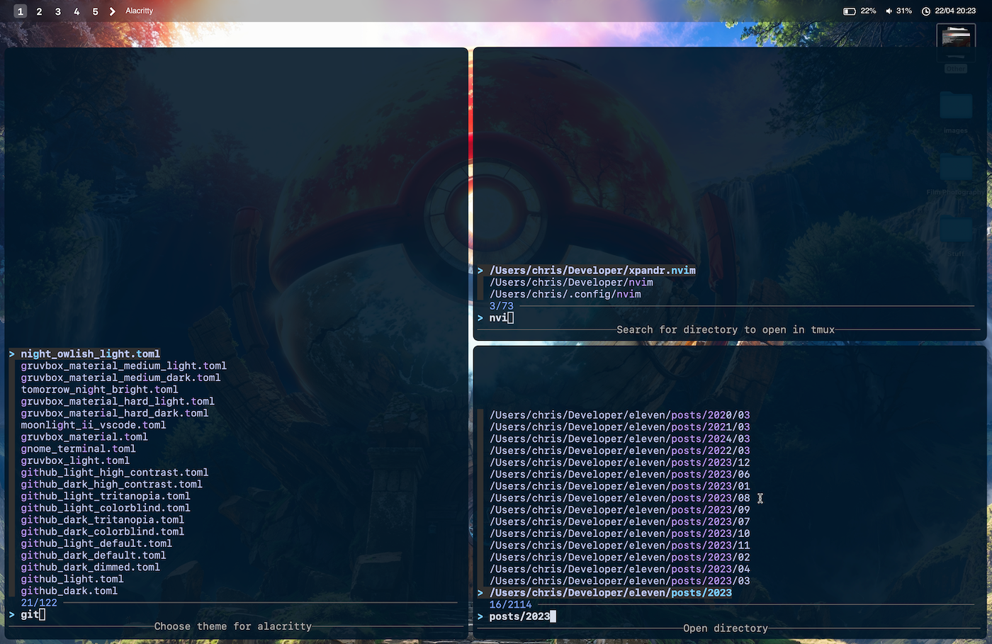
The first three I came up with were all mainly some sort of selector-style tools powered by fzf:
(they may seem like odd names, but I wanted to be able to use these scripts really quickly)
- tg (right-top)- a customed version of tmux-sessionizer that lets you quickly fuzzy find a directory and then attach/reattach to a tmux session with it.
- ala (left)- fuzzy finder for alacritty (my terminal choice) themes, which is then applied on selection.
- fd (right-bottom) - fuzzy finder that searches the current directory for any subdirectories with a max depth of 3. And then changes into the selected directory.
I also made another one that replaces my existing alias for quickly committing and pushing my local changes with Git, and makes the flow a bit more interactive.
Previously I had an alias gacp, which basically meant (to me) "git add commit
push", and did the following:
git add --all
git commit -m "$input"
git push
And I'd use it like this:
gacp "my wonderful code change"
But now with my (aptly) named tool, gt, I just need to type those two letters, and it then lets me quickly run through the process of pushing my latest changes.
First of all, it asks if I want to stage all my current changes (defaults to yes), then it asks what type of commit it is (using conventional commit style), asks for a commit message, and then if I want to push to my remote repo.
So a pretty simple process, but just a bit faster thanks to this little script.
As you can see, I'm clearly having a bit of fun writing these scripts, so don't be surprised when I start uploading even more.
Although my next script/tool will definitely have to be making blog posts easier to start writing. I have a half-baked bash script that creates a basic template, but I think I want to make one with a bit more power, that can be flexible for multiple types of posts. Let's see.